
Have you ever encountered a footer on a page that wasn't stuck to the bottom, either because the page content was too small or the zoom was too distant? This can lead to some sub-optimal user experience! While sticky footers are not a standard Salesforce offering, they are simple to setup, as explained below. Essentially, we will be expanding the screen's content to match the height of the user's screen whenever the content does not reach the bottom of the page. This practice will ensure consistent user experiences across devices and will keep handy footer content in view whenever content size allows.
Step 1: Get the height of your footer and the height of your header
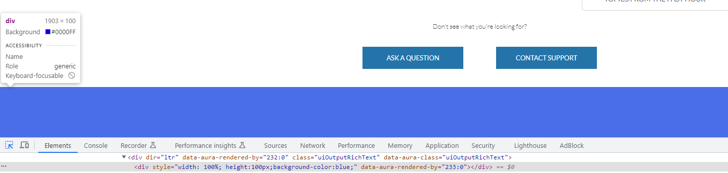
To get the height of your header and footer, use Ctrl+Shift+i to access the developer tools on your browser. Then, inspect the header & footer elements for their heights
Step 2: Find the class of your content body
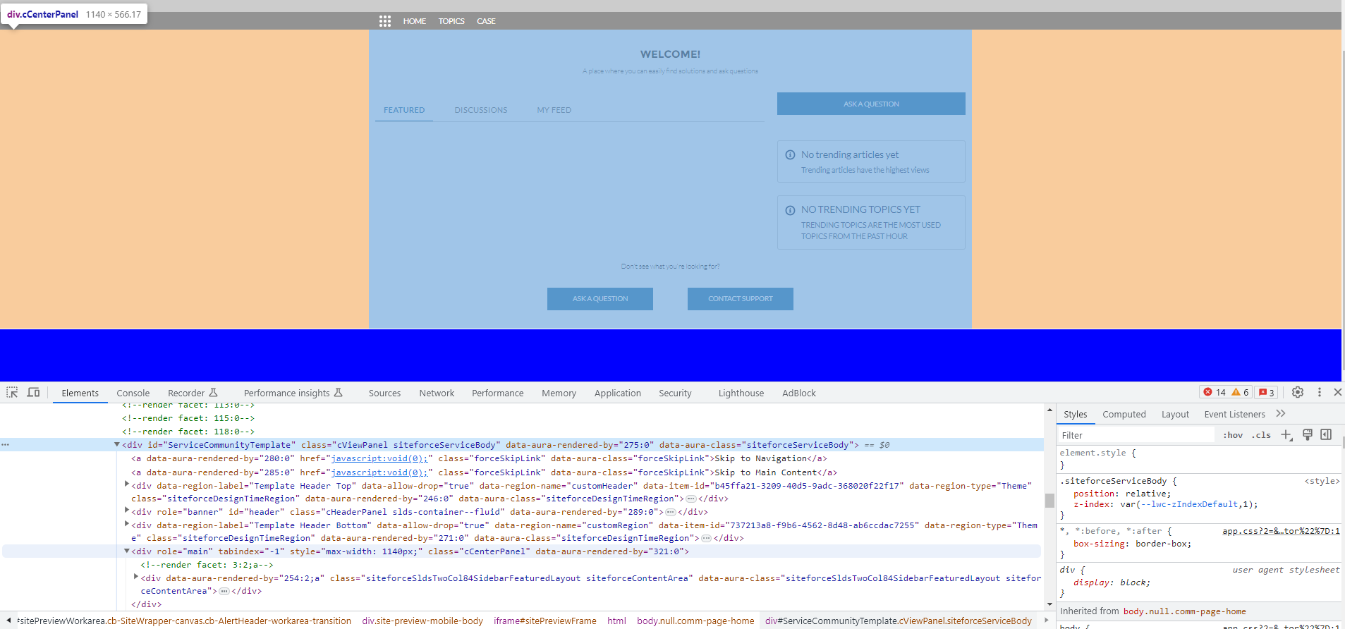
Because different Digital Experience templates use different naming conventions/classes to designate content, we need to take a look via the developer tools to see what our content body is called. Using Ctrl+Shift+i, traverse the HTML to find the name of the class that describes the content starting directly below the header and ending directly above the footer. In my case for my template, the class designation this div carries is cCenterPanel.
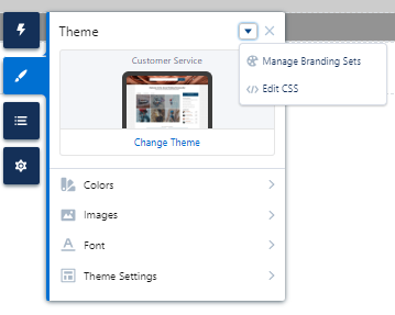
Step 3: Use a CSS override to expand the height of the content
Navigate to the following location in the builder called 'Edit CSS':
From here, use the following code as a reference. Note: because my header height is 144px, my footer height is 100px, and my content class is cCenterPanel, these are the variables I am using in the code. Replace these variables with your own!
.cCenterPanel {
	min-height: calc(100vh - 244px);
}
And ✨PRESTO!✨, your footer should be anchored to the bottom of your screen!